BLUE PEPPER


Blue Pepper had grown, as a company and as a group of people, but the brand had not kept up. It no longer matched the value the agency delivered. So this became more than a new logo. It was a chance to redraw the whole identity and reposition the company around who it really is.
Blue Pepper had grown, as a company and as a group of people, but the brand had not kept up. It no longer matched the value the agency delivered. So this became more than a new logo. It was a chance to redraw the whole identity and reposition the company around who it really is.

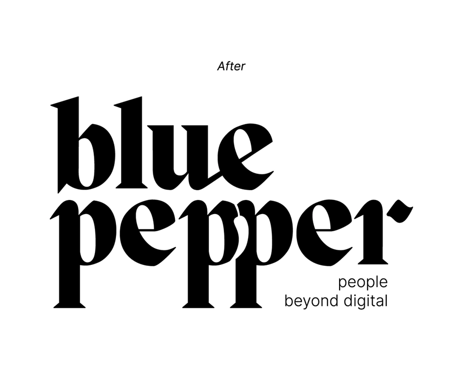
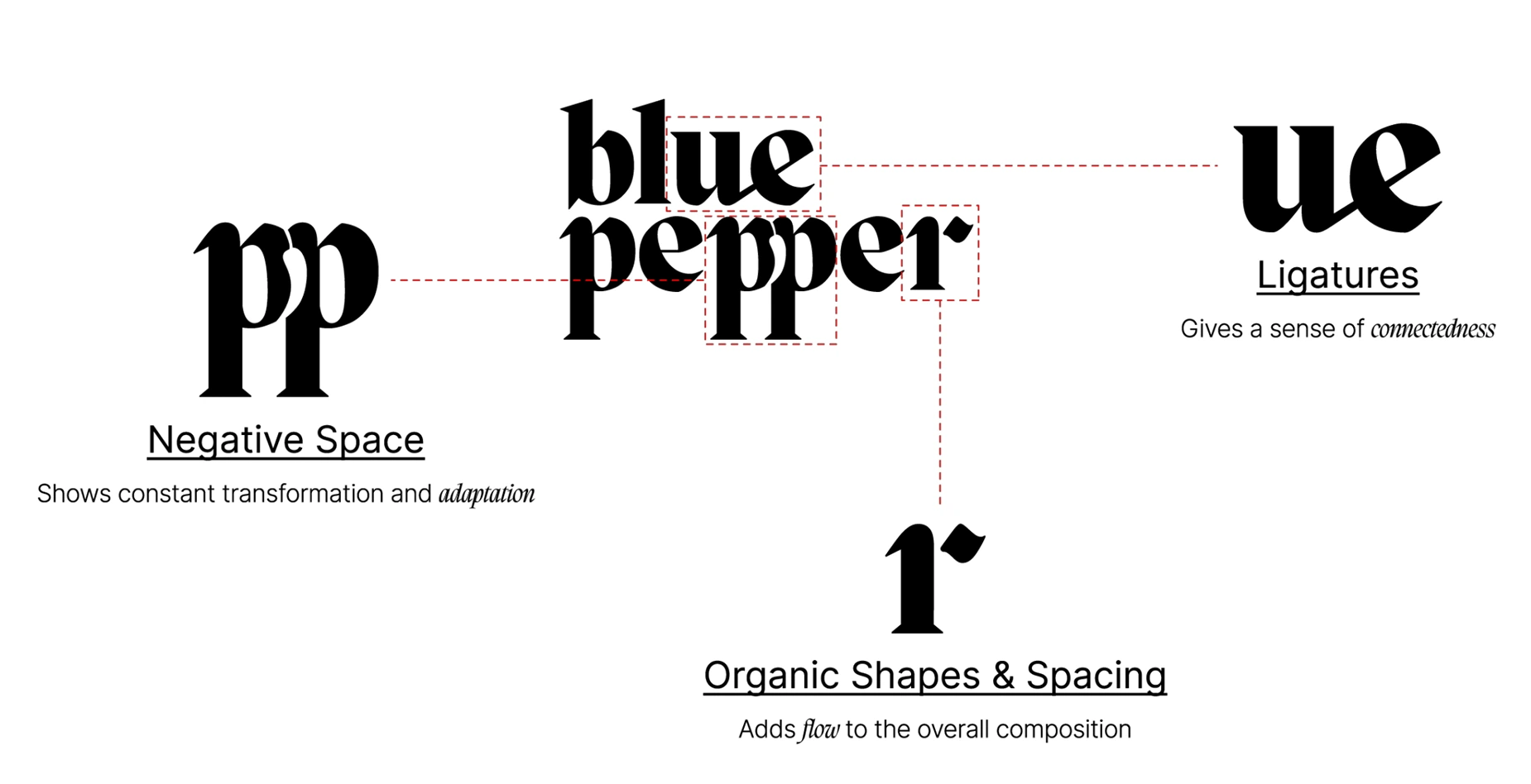
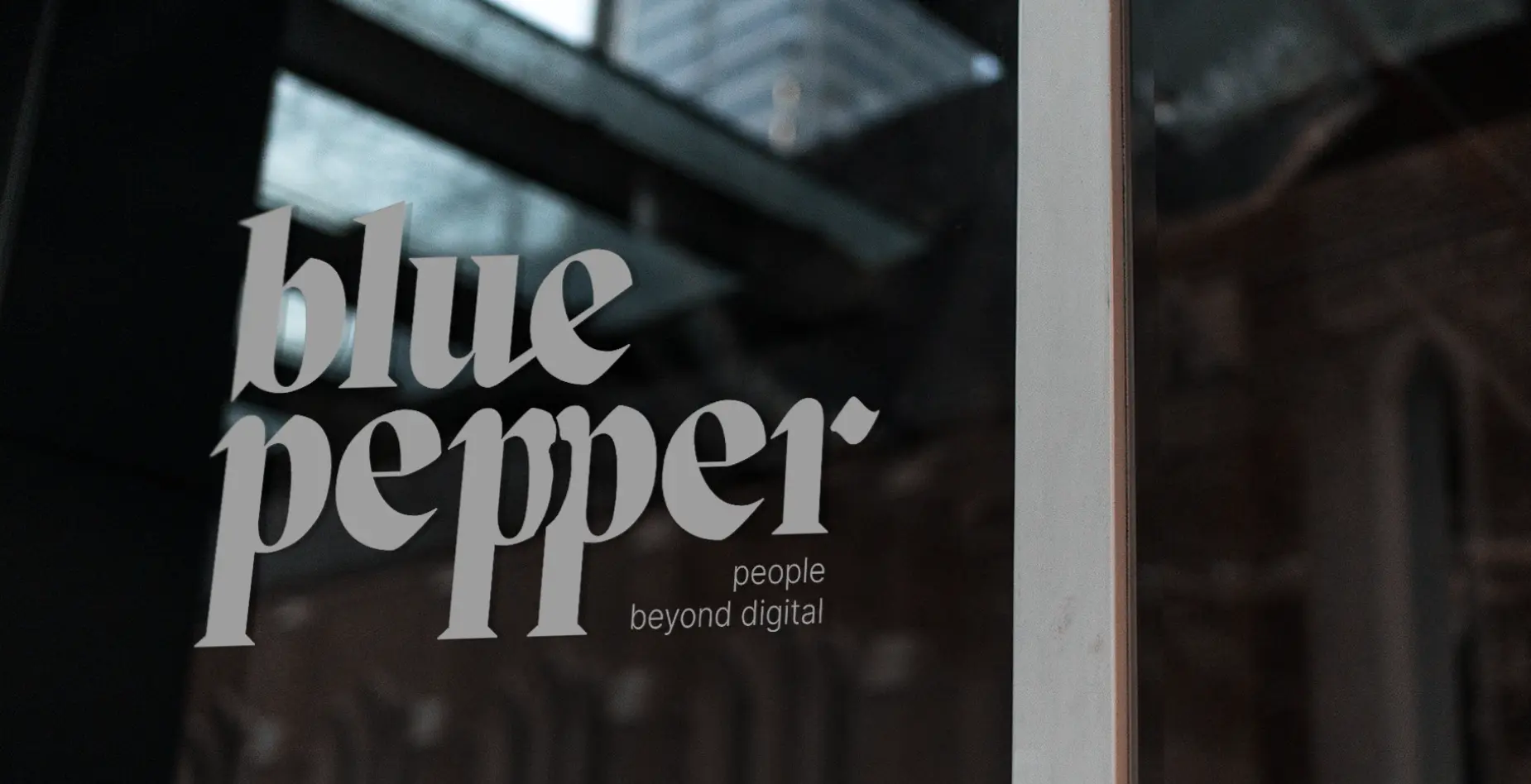
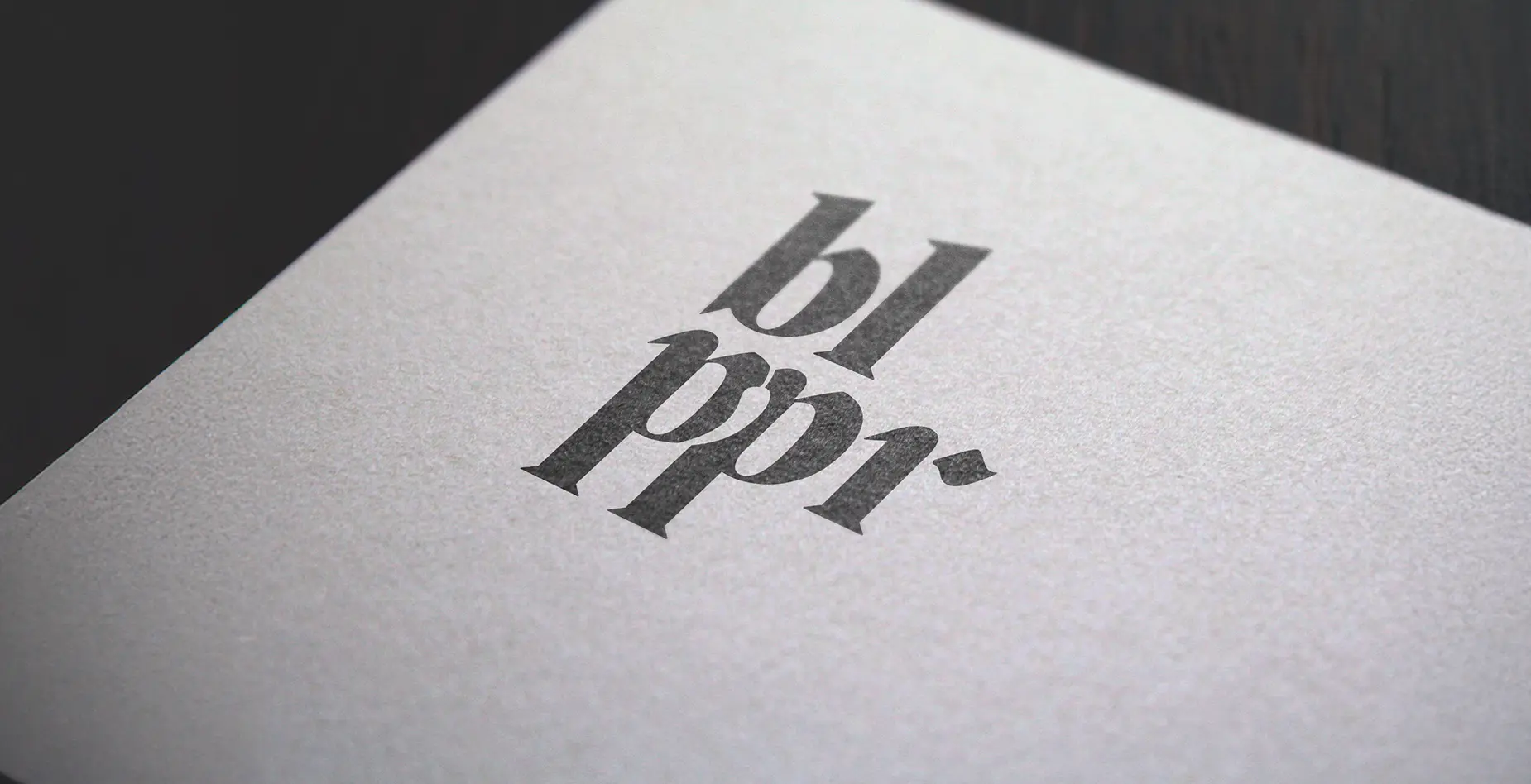
At the heart of the new identity is the logo. We redrew the wordmark from scratch, with custom display letterforms and a small dot detail on the final letter. It comes as a full family of lockups, vertical and horizontal, with and without the “people beyond digital” tagline, and simplifies as it shrinks, from the full signature down to a compact bl·ppr, so it holds at any size and in any context.
At the heart of the new identity is the logo. We redrew the wordmark from scratch, with custom display letterforms and a small dot detail on the final letter. It comes as a full family of lockups, vertical and horizontal, with and without the “people beyond digital” tagline, and simplifies as it shrinks, from the full signature down to a compact bl·ppr, so it holds at any size and in any context.
It started further back, with the idea of identity itself. A person is never a single trait, but a complex system: a mix of skills, experiences, and contradictions built up over time. A brand is the same. Blue Pepper is creative and analytic, pragmatic and adaptable, noisy and clean, and the honest move was to hold those opposites together rather than pick one.
That became the spine of the work:
We’re made of opposites.
A boutique agency built on creative and analytic thinking, working to unlock a brand’s potential and drive its growth.
From there, every part of the system was built to carry one side of that personality and balance it with its opposite. The creative side shows up in open white space and colour. The analytic side answers with ruled lines and monochrome grids. Noisy textures and grey gradients keep the brand human and a little imperfect, on purpose.
It started further back, with the idea of identity itself. A person is never a single trait, but a complex system: a mix of skills, experiences, and contradictions built up over time. A brand is the same. Blue Pepper is creative and analytic, pragmatic and adaptable, noisy and clean, and the honest move was to hold those opposites together rather than pick one.
That became the spine of the work:
We’re made of opposites.
A boutique agency built on creative and analytic thinking, working to unlock a brand’s potential and drive its growth.
From there, every part of the system was built to carry one side of that personality and balance it with its opposite. The creative side shows up in open white space and colour. The analytic side answers with ruled lines and monochrome grids. Noisy textures and grey gradients keep the brand human and a little imperfect, on purpose.
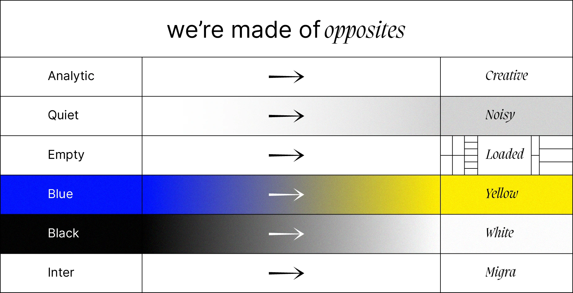

Typography carries the tension most clearly. A clean sans, Inter, sits against an expressive serif, Migra, one for the reasoning and one for the voice, with italics for the moments the brand speaks for itself.
Colour does the same. Black and white hold the base, while blue and yellow act as the charged opposition and bleed into each other across the system.
The system is built to move. When a project calls for it, the brand can drop the restraint and go loud with gradients and colour, always faithful to the same personality underneath.
Typography carries the tension most clearly. A clean sans, Inter, sits against an expressive serif, Migra, one for the reasoning and one for the voice, with italics for the moments the brand speaks for itself.
Colour does the same. Black and white hold the base, while blue and yellow act as the charged opposition and bleed into each other across the system.
The system is built to move. When a project calls for it, the brand can drop the restraint and go loud with gradients and colour, always faithful to the same personality underneath.
The result is a brand that matches the agency behind it. One adaptable identity that reads as creative, analytic, pragmatic, and adaptable at once, and stays human at its core. It runs across the logo, the visual language, the typography, and the repositioning.
More than a rebrand, this resets who Blue Pepper is and how it’s perceived.
The result is a brand that matches the agency behind it. One adaptable identity that reads as creative, analytic, pragmatic, and adaptable at once, and stays human at its core. It runs across the logo, the visual language, the typography, and the repositioning.
More than a rebrand, this resets who Blue Pepper is and how it’s perceived.



Credits
Year: 2023
Agency: Blue Pepper
Creative & Art Direction: Filipe Cordeiro
Concept, Graphic & Motion Design: Filipe Cordeiro
Strategy: Filipe Cordeiro, Djáli Campos, Ana Silvestre
Copywriting: Ana Silvestre, Filipe Cordeiro
Project Management: Djáli Campos